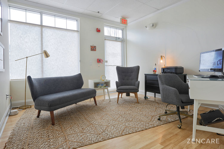
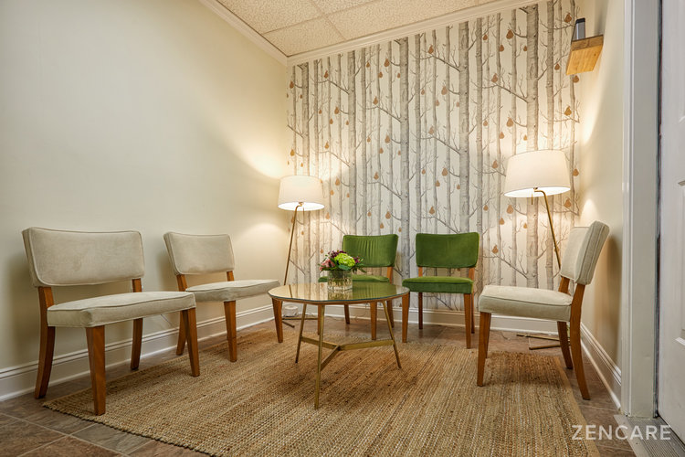
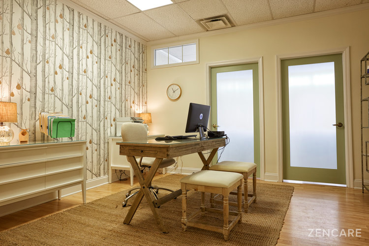
In my practice, I work with clients in a collaborative, comprehensive manner – integrating Functional Medicine techniques alongside psychodynamic and supportive therapies. I wanted to cultivate a space that reflects the holistic, client-centered nature of this treatment style, so when setting up my office, I had four specific objectives in mind:

1) To create a space where the physical experience of the office adds to the "healing" process
Throughout my time in medical training and working in hospitals and mental health centers, I found most health care spaces to be dark, worn-out, and ugly. I noticed how drabby and down I felt going there to work.
I thought how completely antithetical this is to the purpose of our work. People come to us to feel better!
2) Communicate to my clients that they are valued
Throughout my career, it's also seemed like the only nice places I ever saw were cosmetic surgery or cosmetic dermatology offices – and it made me sensitive to issues of mental health parity, as if mental health patients (and providers!) aren't as important or glamorous.
So when it came time to start my own practice, it was important to me to create a space that uses all of the senses to generate feelings of warmth, soothing, and care. I want my patients to know that they are "worth" the doctor to invest in making a nice space for them.
I chose an office suite that is sunny, in a building that has good curb appeal, comfortable parking, and is near enough to the town center that it has lively energy and vitality; it doesn’t feel hidden away.

3) Use concepts of Functional Medicine to create an environmentally clean and healthy space
I worked very hard to institute environmentally sound materials wherever I could in my office decorating process. For instance:
- Most of my furniture is repurposed, so that the pieces have had plenty of time to "off-gas" any volatile organic compounds (VOCs).
- I painted the whole unit with indoor paints that are low VOC as well (more expensive, but totally worth it!).
- I minimized tapestry whenever possible in favor of easy to clean and low-allergenic surfaces, such as the original non-carpeted flooring and glass tabletops.
- Where I do have rugs on the floor, I kept to natural materials and non-synthetics (e.g. jute, sisal, etc.).
While it was not possible for me to do this with everything I purchased or put in the space, especially since it is not my own building, I made sure to do this wherever I could, even if it was more expensive.

4) Make the space pretty!
Being in a pretty space is important to me – and, I think, to most people – but it can often be overlooked or trivialized. I wanted the office to look nice and reflect a professional but very approachable personality. Not overly feminine and not overly serious, but with a touch of whimsy, which reflects my personal style.
That's the philosophy in a nutshell.

How I did it: The nitty gritty details
In terms of how I actually accomplished my objectives, I would first clarify that while I like interior design in general, I certainly don’t love doing it! I don't enjoy all of the work that goes into thinking through each detail and researching choices. Also, I don't have a lot of time, since I'm either mothering or doctoring – which are my most important jobs!
I was also in a bit of a time crunch to get the office started, so I realized that I needed to get help and do some delegating.
Finding outside help from a designer
I did a little research on local interior designers, and I hired one who did a fine job. I just needed a few hours of his time – since it was such a small project.
One of the most important things the interior designer did was measure the space and guide me as to which furnishings would fit where. I have a poor sense of space and dimensions, so this was critical for me.
Communicating my initial vision
I started off with a conversation about my philosophy and objectives, and set him up with the furniture I already had, the colors I wanted, and a slew of Pinterest pictures for the style I was going for: A warm Scandinavian/mid-century modern aesthetic.
Incorporating furniture I already had with new pieces
I already had many furniture pieces that fit into this style, and the rest came from Craigslist (for older pieces that are Danish/mid-century design, like the chairs in my waiting room), or World Market, Home Goods, and Target.
A bold, modern flourish
My designer had access to wallpapers that were "to the trade." I wanted a unique accent for the office, a "keystone" type of element, and when he showed me some wallpapers and I saw the pear trees, I knew that was it.
It is modern, uncluttered, and organic because of the trees and pear elements. Even though as a small sample it looked a little risky, it suits the space perfectly – and everyone has loved it!